Last updated: October 2026
Disclosure: The section on tracking the pattern uses TakeProfit‘s charting tools as a worked example; other charting platforms offer comparable drawing tools and price alerts.
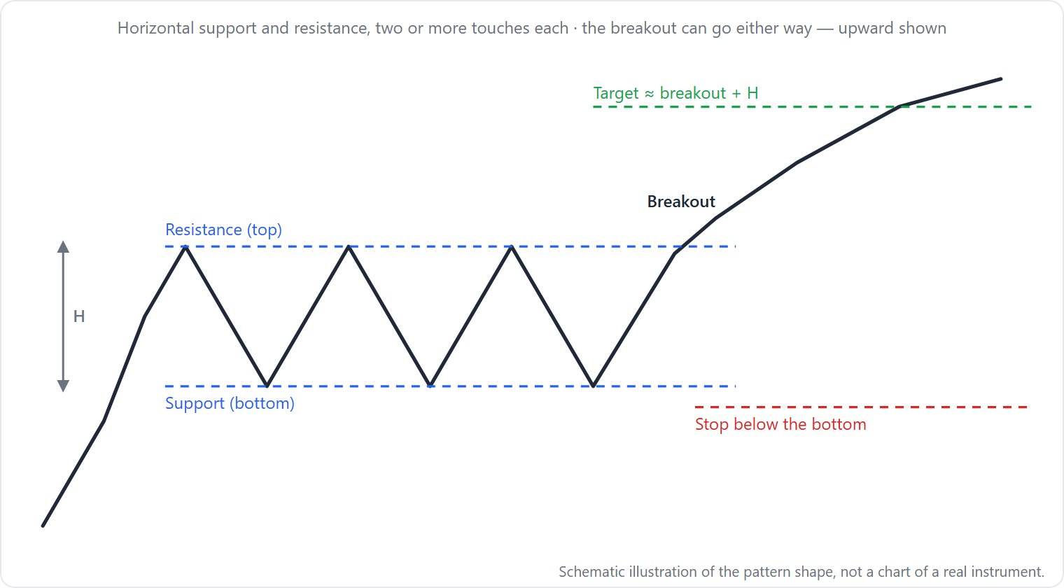
Quick answer: A rectangle pattern is a sideways price range bounded by horizontal support and resistance, signaling a pause in the prior trend. It can result in a bullish breakout above resistance or bearish breakout below support, confirmed when price closes beyond the boundary with above-average volume.
At a glance – key facts
| Attribute | Detail |
|---|---|
| Type | Continuation pattern (some sources also treat as reversal; see conflicting definitions) |
| Signal direction | Bullish above resistance; bearish below support |
| Where it forms | During a pause in a prior uptrend (rectangle top) or downtrend (rectangle bottom) |
| Typical duration | Weeks to months (StockCharts, 2026) |
| Touch requirement | At least two touches on each boundary; Bulkowski prefers 3 on one side, 2 on the other (Bulkowski, thepatternsite.com, June 2024) |
| Volume | Declines during formation, spikes on breakout |
| Entry trigger | Buy stop above resistance or sell stop below support, after a close outside the boundary |
| Stop placement | Beyond the opposite side of the rectangle |
| Target method | Add rectangle height to breakout level for upside target; subtract for downside target |
| Common failure | False breakout (price re-enters range); busted rectangle (breakout reverses past opposite side) |
How to identify a rectangle pattern
Start with a clear prior trend. Price must enter the consolidation from a directional move: upward for a rectangle top, downward for a rectangle bottom (Bulkowski, thepatternsite.com, June 2024). Without this, the pattern lacks context.
Draw two near-horizontal trendlines that bound price action. StockCharts (2026) requires them to be parallel and horizontal; an earlier source, Edwards and Magee (as summarized by PhanTran, 2021), allowed a slight tilt as long as the lines remain parallel. For practical identification, strict horizontality is safer.
Count the touches. StockCharts states at least two equivalent reaction highs and two equivalent lows—four total touch points. Bulkowski recommends a stricter rule: at least three touches on one trendline and two on the other, using distinct peaks and valleys. Be flexible, as markets rarely align perfectly with textbook definitions. A touch is counted when price approaches the line by a few percent, not necessarily a precise kiss.
Volume should trend downward during the formation. StockCharts notes volume “probably” spikes heavily immediately after the breakout. While this is not a mandatory rule, it strengthens the signal.
Do not assume breakout direction. Bulkowski found upward breakouts occur 63% of the time in rectangle tops and 59% in rectangle bottoms (thepatternsite.com, June 2024). Wait for a close outside the boundary to confirm.
Why it forms – crowd behavior
The rectangle represents a temporary equilibrium between buyers and sellers. As StockCharts (2026) explains, bulls buy near support, expecting the prior trend to resume, while bears sell near resistance, betting on a reversal. Each side grows more confident until one group overpowers the other, resulting in a breakout. This is an interpretation of price action, not a causal mechanism, but it frames the pattern as a battle of expectations.
How traders trade it
Entry and stop conventions
Breakout method: Place a buy stop one tick above resistance or a sell stop one tick below support. Enter only after price closes outside the boundary (Bulkowski, thepatternsite.com, June 2024). This avoids premature entries on intraday spikes.
Range trade (for advanced traders): If the rectangle is tall enough, buy at the bottom trendline and sell at the top, reversing the position on each touch. This requires tight stops outside the opposite boundary.
Stop loss: For long trades, place a stop below support. For short trades, place a stop above resistance. Allow a small buffer to avoid noise.
Worked example (illustration)
A stock forms a rectangle between support at $100 and resistance at $110. The prior trend was up. The rectangle height is $10 ($110 – $100). Price closes at $111 on heavy volume, breaking above resistance.
- Entry: Buy at $111 after the close.
- Target (measured move): Add the height ($10) to the breakout level ($110) → target = $120.
- Stop loss: Below support at $99.50 (allowing $0.50 cushion).
- Risk: $111 – $99.50 = $11.50.
- Reward: $120 – $111 = $9.
- Risk/reward ratio: 9 / 11.5 = 0.78 (unfavorable; trader might adjust stop or target).
This is a hypothetical example for illustration only and does not represent a real trade.
What the evidence says
Thomas Bulkowski’s analysis of more than 1,000 perfect trades in rectangle tops (thepatternsite.com, June 2024) provides the largest publicly available dataset:
- Average rise after upward breakout: 51%.
- Average decline after downward breakout: 13%.
- Break-even failure rate: 15% for upward, 34% for downward.
- Percentage meeting the measured-move target: 78% for upward, 54% for downward.
- Throwback/pullback occurs in 66% of upward breakouts and 64% of downward breakouts.
For rectangle bottoms (more than 900 perfect trades; thepatternsite.com, June 2024), upward breakouts occur 59% of the time. He notes that rising volume trends improve performance regardless of breakout direction, and breakouts near the yearly low perform best.
These numbers come from “perfect trades”—entries after a confirmed close outside the boundary, assuming no slippage. They reflect historical behavior and are not predictive. No academic study specifically testing the rectangle pattern was found in the reviewed sources.
When it fails
Four distinct failure modes, each with observable chart behavior:
-
False breakout (whipsaw): Price momentarily pierces resistance or support but closes back inside the range. This often happens on low volume or after a news gap. What to see: a long wick beyond the boundary followed by a close within the rectangle. A trader who entered on the initial break would be stopped out.
-
Throwback/pullback: After a clean breakout, price retraces to the boundary but does not re-enter. Bulkowski’s statistics show this occurs in roughly two-thirds of cases and reduces average post-breakout movement. What to see: a close beyond the boundary, then a reversal that touches the line from the outside without crossing it.
-
Busted rectangle: Price breaks out less than 10% from the boundary, reverses direction, and closes beyond the opposite side. Bulkowski (thepatternsite.com, December 2020) found that for a single bust, an upward breakout that busts downward loses an average of 22%, while a downward breakout that busts upward gains an average of 71% (based on rectangle tops in bull markets). What to see: a breakout fails to extend more than 10%, then price reverses and closes on the other side of the range.
-
Partial rise/decline: Price moves partway from one boundary toward the opposite side, then reverses. A partial rise (mid-range) predicts a downward breakout with 75% accuracy; a partial decline predicts an upward breakout with 79% accuracy (Bulkowski, thepatternsite.com, June 2024). What to see: price bounces from support but stalls at the center of the range, then turns and heads for the lower boundary.
Look-alikes
| Pattern | How it differs | Where to read more |
|---|---|---|
| Flag | Slanted trendlines (non-horizontal); shorter duration (days); sharp prior trend | /bull-flag-bear-flag |
| Symmetrical triangle | Converging trendlines (not parallel); price touches fewer times on each side | /rising-falling-wedge |
| Double top/bottom | Only two touches at one boundary; no full range between parallel boundaries | /double-top-double-bottom |
| Triple top/bottom | Three touches on one side but the other side lacks multiple touches; breakout often faster | /triple-top-triple-bottom |
A rectangle is not the same as a general congestion zone; it requires at least two touches on each side to confirm the boundaries.
Tracking it on a chart in TakeProfit
TakeProfit does not automatically detect rectangle patterns. You must identify the formation manually. Follow these steps:
- Draw boundaries: Use the Horizontal Line tool (Alt+H) to mark support and resistance levels. Alternatively, use the Parallel Channel tool (Alt+Shift+C) to draw a corridor that fits the price action.
- Measure height: Use Quick Measure (Shift+M) to find the vertical distance between the two lines.
- Set an alert: Right-click on the resistance or support line and choose Add Price Alert. Configure the trigger for when price closes outside the line (available in alert settings).
- Plan the trade: Use the Long-Short Tool (Alt+L) to visualize entry, target (based on height projection), and stop loss. The tool displays risk/reward ratio in real time.
Limitation: TakeProfit does not highlight potential rectangles or warn you when one might be forming. You must scan charts manually. The tools only assist after you mark the pattern yourself.
FAQ
What is a rectangle pattern?
A rectangle pattern is a sideways price range bounded by horizontal support and resistance levels, signaling a pause in the prior trend before a breakout.
How to trade a rectangle pattern?
Buy when price closes above resistance, sell when price closes below support. Place a stop beyond the opposite boundary and target the rectangle’s height projected from the breakout level.
What is the success rate of rectangle patterns?
Thomas Bulkowski found break-even failure rates of 15% for upward breakouts and 34% for downward breakouts in rectangle tops (more than 1,000 trades). Performance varies by market conditions.
What causes a rectangle pattern to fail?
False breakouts (price re-enters the range), throwbacks/pullbacks (retest of the boundary), and busted patterns (breakout reverses past the opposite side) are common causes.
What is a busted rectangle?
A busted rectangle is one where price breaks out less than 10%, reverses, and closes beyond the opposite side. Single-bust downward breakouts that then rise averaged 71% gains in Bulkowski’s study.
Is a rectangle a continuation or reversal pattern?
Most sources treat it as continuation (StockCharts, 2026), but some argue it can be reversal depending on context. One StockCharts page identifies it as a continuation, while another treats it as a reversal (StockCharts, 2020).
Trading involves risk. Past performance is not indicative of future results. This educational content is for informational purposes only and does not constitute trading advice.
Learn how to draw trendlines and set alerts in TakeProfit by visiting the Line tools documentation.